Overview
The WealthWise is a mobile app to help young adults in budgeting, saving money, and overcome unnecessary expenses. User can track their money, manage their expenses, and set goals to save money for that. The typical users are young adults.
The Problem:
Many undergraduates get drowned in the world of expenses due to a lack of financial management as they don't have any real-world experience to manage their expense.
The Solution:
An app that helps users develop a habit of tracking their expenses, managing their money, and setting their goals also deposit money on regular basis to fulfill the goals.
UX/UI designer responsible for conducting user research and interviews, paper and digital wire-framing, low and high-fidelity prototyping, conducting usability studies, accounting for accessibility, and iterating on designs.
Role & Responsibilities:
RESEARCH
Understanding the user
I conducted interviews and created empathy maps to understand the users I am designing for and their needs. I discovered that many target users like tracking their expenses and saving for future goals.
However, many budgeting and saving money apps are overwhelming and confusing with a lot of features. Most apps are made for people who have already disciplined themselves about their own money. For young adults who don’t have any previous experience with managing finance applications, for them, it’s difficult to start saving money without any proper guidance. With the guidance, they also need some everyday reminders to manage their finance.
User Pain Points
Lack of Guidance
There is no proper guidance for the person who don’t have experience in finance management
Irrelevant Information
Too much information before users can get access to the piece of data they want; it’s tiring
Not for young adults
Most apps are made for people who already have disciplined themselves about their own money
Competitive Analysis
We looked at several potential direct competitors with WealthWise
The majority of the features between competitors were very similar, however the main differences that we noticed were:
Linked bank account vs unlinked bank account
Messy interface vs clutter-free interface
Overwhelmed with information vs highlighting the useful information
Informative reports vs basic reports of the transaction
Push-notification about your due bills vs no notification
See detailed chart HERE
Persona
Problem statement:
Belinda is a student working as a server want to manage her expense and figure out her wants and needs So that she can save money for emergencies and future goals.
Problem statement:
Dave is a full-time retail associate who wants to manage his finance and pay bills on time So that he can save up some money to afford the cost of college.
User Journey Map
Mapping user journey relieved how helpful it would be for the users to have access to the budgeting and saving money app for a better experience.
Belinda - Goal: Make a budget and want to control expenses and save up money
Start Designing
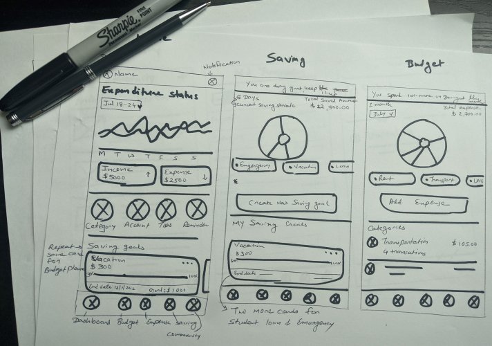
Taking the time to draft iterations of each screen of the app on paper ensured that the elements that made it to digital wireframes would be well-suited to address user pain points. For the home screen, I prioritized expenditure status for quick user access.
Digital Wireframes
As the initial design phase continued, I made sure to base screen designs on feedback and findings from the user research. The screens below shows the design of 3 primary features of the app- Expenditure, Budgeting & Savings.
After creating the digital wireframes the low-fidelity prototype connected the primary user flow so that the prototype could be used in a usability study with users.
Usability Testing
After Creating the digital wireframes and Low fidelity Prototypes, I conducted the first usability testing and the data is analyzed & synthesized in an Affinity Map for better understanding of the themes and prioritizing insights from the study.
Based on the above affinity map the main insights drawn from the Usability study were as shown below. Findings from the first study helped guide the designs from wireframes to mockups.
1
User needs a way where they can see both (weekly & monthly) expenditure status
2
Provide an alternative way where chart representation is not only dependent on color codes
3
User wants a convenient way in the budget screen where they can add a category anytime they want
Iterations- Refining the Designs
After the usability study, I added both weekly and monthly expenditure status so the user checks expense status as per need.
In the usability study, the user was not able to see the add new category button. For user attention, I added a category button in the budget screen at top of the category section. So they can add categories directly from that screen and no need to go to the home screen
Hi-Fidelity Mockups
High fidelity prototype
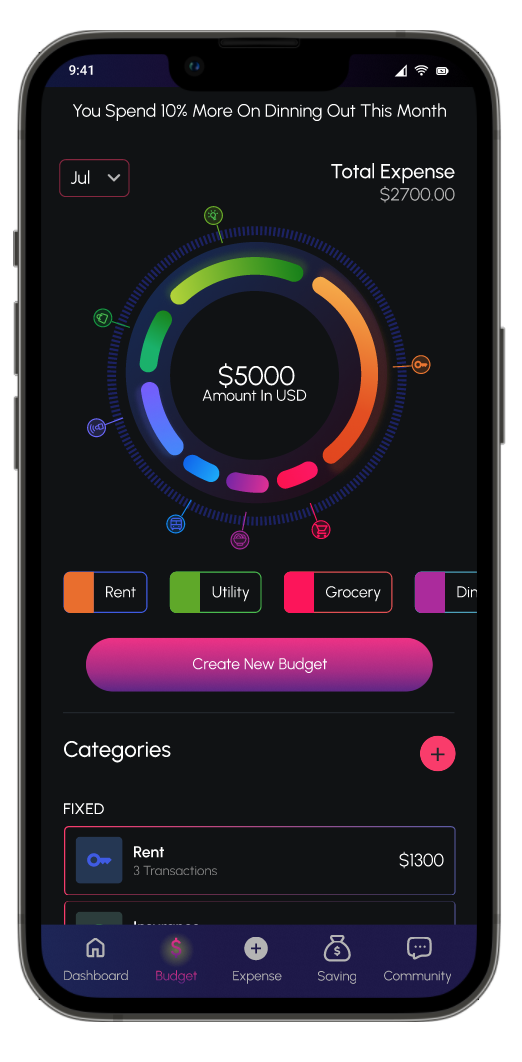
The final high-fidelity prototype presented cleaner user flows. It also met user needs for adding both expenditure status, category button, patterned graph, and more.
Accessibility Considerations
Different- sized headings text for a clear visual hierarchy
Used color and pattern both to represent chart
Kept in mind accessibility and used high color contrast
Welcome screen
When you open the app the first thing you see is little logo animation and a welcome screen that shows what this app offers.
Sign In/Sign Up
Users can sign in to explore the features of the app and if you don't have an account then you can create one with the easy and simple steps.
Budget
The user can see their budget in pie chart format. Also, the user can create a new budget, create a category, and the dollar spend on each category.
Savings
The user can see their saving in pie chart format. Also, the user sees all saving goals, create new saving goals, add or withdraw fund to their goal and edit their goals.
Community & Expenses
The user can also read articles and post their questions through the forum and read other people's questions. Through the expense screen, user can add their expenses or save in a particular category.
Other Features
The user can explore some other valuable features like creating a category, yearly expenditure report, add a new account, setting reminders for a particular category, notifications, and profile.
The designs for screen size variation included mobile, tablet, and desktop. I optimized the designs to fit specific user needs of each device and screen size.
Responsive web design
UI Kit
Takeaways
Impact
Our target users shared that the design was intuitive to navigate through, more engaging with the color choices, and demonstrated a clear visual hierarchy.
Also, the simple design and limited features which is easy to understand for an inexperienced user in money management. The community is a great way to learn about saving and managing money.
What I learned
I learned that even though the problem I was trying to solve was a big one, diligently going through each step of the design process and aligning with specific user needs helped me come up with solutions that were both feasible and useful.


